Debate over whether a call to action (CTA) should be subtle or obvious has endured for some time. The CTA is an intrinsic part of your website and creates a venue through which website traffic becomes repeat visitors and customers. Following a few simple techniques such as a squint test can help make sure your CTA is effective.
What is a Call to Action?
The CTA uses a command to do something for a reason. For example, an action verb is linked to a benefit such as inviting visitor to click here to learn more. By doing that, the visitor is taken to a page where he or she provides information for the purpose of getting something in return. The enticement you offer can be in the form of an eBook or a newsletter. The form at the very least gathers information such as the visitors email address or interests. Doing this establishes a relationship with the visitor, creating an element of trust by using lead generation tips.
What Is a Squint Test?
A squint test is a way to tell if the main point of the page comes through whether you can read the text or not. If the CTA conveys the focus of the page, you are on the right track.
How Do I Make the CTA Obvious?
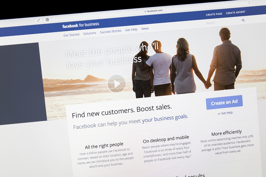
If the CTA is not seen, it won't work. It can be a button or embedded in the text. Besides being well crafted, the CTA must have some distinguishing features. Whatever format you choose, the language needs to be clear and brief. Color is important. The human mind is captivated by color. If the webpage is blue, using red for the CTA is effective. In one study of 600 individuals, using a red button caused conversions to increase by 34 percent. Facebook uses effective buttons at the end of a post, urging users to share.
How Do I Write a Good CTA?
Be brief. The CTA should convey the thought in a few well-chosen words. It should start with an action verb. In addition to telling the visitor to download something or attend a webinar, tell them what they will receive if that happens. Linking an action to a benefit is what the mind needs to acquiesce. The CTA should take the visitor to the website landing page, and using a CTA marketing tool on a website hosted by HubSpot helps you link it to a particular web page.
Where Should a CTA Be Placed?
The CTA should never be below the fold. For the most part, a web site visitor will not scroll down the page to find it. However, placing a post it or share it button at the end of text works. One other thing -- don't bury it in a banner that obscures it. Make sure it can be seen and encourage the visitor to use it.
How Do I Decrease Risk While Maximizing Urgency?
While the CTA is aimed at conversion, it should not sound risky. Providing the eBook or newsletter without charging for it makes the visitor feel secure. Using language that indicates the download might be for a limited time imparts a sense of urgency. This encourages the visitor to do it before it's gone. One way to encourage visitors to attend a webinar is by saying seating is limited.
Overall, the CTA should jump off the page while not detracting from the page's intrinsic message. DigitalInbound can help you not only increase website traffic but follow through with lead conversion. Using a strong CTA is one way to increase sales.

